Saturday, July 1, 2017

Pasta

Joe was running low on TP so he stopped in at his local supermarket to pick some up.


Turns out they were having a sale on pasta—three boxes for two dollars!—so he figured he'd stock up.


He got several different kinds because of course the variety of shapes are fun; though he also got some regular old spaghetti.


They each have a different recipe on the back. Joe might try some, if he's feeling ambitious. Alas, he's not really much of a cook.


Luckily for Joe, they also have some simple stir-in ideas on the side, if he's not quite up to attempting Mama's Artichoke Pasta Salad.


Oh, and he also got his toilet paper. It's just the store brand, nothing fancy.


***

So, this is what happens when I get a new printer for my birthday (yay!); I make ridiculous printables for Joe's (someday) kitchen. By which I mean, I spent way too much time designing the pasta boxes, coming up with the brand name, the copy (including the story of Maria-Louise Caroni), the recipes, &c. But it's so much fun. I did the little Hamm's brown paper bags too, printed on cut up lunch bags. I'm really very pleased with them.


Oh, and I (digitally) painted the portrait of Maria-Louise in the style of over-enthusiastic hopped up on Little Yellow Pills '50s housewife art (it's a genre!)


Here's her story, from the back:

After her husband was killed in the Great War, Maria-Louise was left with seven hungry children to feed. But she also finally found the freedom to pursue her dream of starting a business making pasta using only the finest of ingredients.

Heh.

While I didn't actually test any of the recipes, they're at least plausible. I may try some for real, just to see.


The pasta boxes are filled with seed beads; it gives a nice weight to them, while they also make something like the right noise. The spaghetti is filled with bristles from a house painting brush, cut to the right length. Not that you can see them; I very deliberately left out the little clear windows that pretty much every pasta brand has these days, because I really didn't want to have to make all those tiny little pasta shapes out of polymer clay, yikes.

They're on glossy photo paper, which turned out to be just the right weight to look like one sixth scale cardboard. They're probably a little bit too glossy for my tastes, but they work well enough. They're also printed out at 600 dpi, which means the tiny type is readable, if your eyes are good enough (mine just about are). Not that my blurry photos are doing them justice, I know.

I think I'm going to start Joe's house with a room box of his kitchen, since I've never made a dollhouse before. It'll allow me to work out placement and such, and hopefully I can just reuse the furnishings when I get to doing the real thing.

Labels: , ,

Wednesday, July 20, 2016

Ruby Lustre Tile


This time it's one of William De Morgan's ruby lustre animal tiles in an appropriate frame, William De Morgan being a very famous potter of the Arts and Crafts Movement in England. (I keep wanting to put a 'Pickering' in there, but no, that was his wife Evelyn, the painter). He made a whole series of animal tiles, hares and hedgehogs and owls and even one with a kingfisher spearing a fish; I'm not entirely sure what this thing is, but I'll bet he got it from a medieval manuscript. It has that naive little-kid feel to it (though his other animals were quite wonderfully naturalistic). I suppose we can just call it a 'monster' and leave it at that.


The frame is oak, with decorative copper studs in the corners.


The back has little hooks and eyes and a new piece of string, courtesy of Joe:


Now Joe just needs a wall.

***

Both the tile and frame are out of matboard, again; I painted the lil monster on in acrylic, then gave it a coat of (of all things) Elmer's glue. I was looking for something thick and glossy; I tried gloss acrylic medium at first, but even thinned down it left obvious brushstrokes (I was using the kind artists use for painting, because it's what I had). It just wasn't the right consistency. But the glue worked fine, though it left a few bubbles in the 'glaze' (which is a real no-no in actual ceramics). Still, it's surprisingly convincing, I think, for all that it's just a piece of cardboard.

I made the little eyes out of earring loops that I twisted around (the wire I had was pretty soft, and I didn't trust it to hold its shape). The 'string' is a single strand of embroidery floss twisted and looped back on itself, then tied around the eyes, and glued down, so the weight (such as it is) isn't actually on the eyes themselves. I know in most one twelfth scale dollhouses paintings are simply glued directly on to the wall; I quite like miniatures to be 'workable' as much as they can be, though of course it's easier to get away with it at one sixth scale, because things like gravity actually start having a hold on things. Who knows, when I actually hang it in his living room (when I make his living room) I made end up yanking the eyes out and gluing it to the wall anyway. But for now, it's a thing unto itself.

Labels: , , ,

Thursday, July 14, 2016

Scratching Post

Well, it's not anything from the Arts and Crafts Movement, but it's a necessity if one is to protect one's Arts and Crafts Movement furniture, so I made Joe a scratching post. For the cat he doesn't have yet, for the house he hasn't built yet.


You may notice the presence of a paw and a little bit of a pink nose in the corner; that's my 1:1 cat, Ratty, for scale. Here's a better picture of him, sitting in front of the fan to keep his floof extra floofy:


***

This one was pretty simple, though it took me a while to hit on the correct yarn for the 'rope'. In the end I used some silk yarn I had for dyeing, and twisted it back on itself, then glued it around a dowel. The bottom is two layers of matboard thick, made to look like plywood (though I didn't get a picture of the bottom), with a hole cut out to fit the dowel into in the first layer. That and the thickness of the 'carpet' (velveteen) is enough (I hope) to hold it all together with a bit of glue. The velveteen is a scrap left from the 70s, I'm pretty sure, and it's not as bright a green as the picture makes it out to be, but I figured it would work well with Joe's proposed earthy toned living room. It works pretty well for 1/6 scale carpet, I think.

Now Joe just needs a cat.

I've been looking at Craftsman house plans again, and I think I've finally figured out what I want to do with the staircase. I wanted the house to have a bit of an open plan, at least as far as the living room and entry way go, but it was very tricky trying to figure out which direction to put the staircase in, given that a dollhouse is strangely one-sided. I wanted it to have all kinds of lovely open woodwork, but I also wanted to get a piano on that wall. I think if the staircase opens out in the living room (rather than the hallway per se), then turns up and around, there will be enough room against it to put a (hopefully Manx) upright piano. That's what I'm going to shoot for anyway. We'll see.

Labels: ,

Tuesday, September 29, 2015

Frame

Joe went antiquing again to furnish the house that he hasn't built yet, and this time he found an Arts and Crafts Movement picture frame, which is very excellent!


It didn't come with any art in it, but that's not a huge problem. Though maybe a mirror would go in there very nicely?


The frame is oak and has some simple mother-of-pearl inlays; he'll have to rig up something to hang it with in the back, as there's no wire, but you can see the old nail holes from where there used to be some:


It will be a very nice addition to Joe's (theoretical) Craftsman bungalow, I'm sure.

***

It's made of mat board, of course, and is based on a real one I came across on an antique dealer's site when googling Arts and Crafts Movement library tables last night. The original one was actually just the frame for a piece of embroidery by Ann MacBeth, one of the artists of the Glasgow School if I'm remembering correctly. Here's a screencap of the original:


The 'mother-of-pearl inlays' on Joe's version are just some paper painted with iridescent white acrylic paint; I actually did cut out the bits from the frame and peeled off the outer layer to make space for the painted paper, so it's an inlay of a sort. It worked pretty well.

The finish is similar to that of the Stickley cube chair I made earlier, and it really is ridiculously easy. It's just layers of thinned down acrylic paint in several layers starting with yellow ochre, then mixing a bit of red in it to make it more orangey, then finishing with a layer or two of burnt umber. (If it's too brassy, tint the umber slightly purple). The key is to keep it pretty thin, and to use a fairly stiff brush so it makes lots of brush strokes, which will look quite remarkably like wood grain. Just make sure you don't follow the contours too much; just let it all be mostly parallel. Seriously, I kind of can't believe how realistic that looks, for so little effort.

Oh, and I didn't make the bevels; the mat board I'm using is left over from when I worked at a frame shop, and are the bits cut out of the center of other mats. So they pretty much all have beveled edges. They came in handy this time!

Anyway, if I had a working printer right now I'd totally print out Rossetti's drawing of Jane and his sainted wombat to go in it, because holy moly that thing is awesome.

Don't believe me? Like I could make that up:


Oh man.

Labels: , ,

Sunday, September 27, 2015

Apples

I made some little polymer clay apples for Joe; they come to about a half inch across at one sixth scale. They look pretty good in the photos, but trust me they're covered in fingerprints because I haven't figured out how to make something like this without actually touching it. It has to be possible; other people manage, somehow. I'm still ridiculously proud of them though.


I made sure to put some bumps and bruises on them; they're also a bit misshapen, modeled after the ones we had down in the kitchen which might have been locally grown. They're cooking apples, anyway, Macouns maybe, and aren't perfect. I kept finding pictures of all these perfect little (one twelfth scale) tableaux with perfect little fruits, cut perfectly and arranged perfectly in perfect pie-making scenes, and while those are certainly nice, they kind of actually fail the realism test because no one, not even people on cooking shows who have paid stylists, can actually make anything that picturesque. I'm not knocking that sort of thing, mind you; those kind of tiny still lifes are very wonderful. But I know what reality looks like too. And it's waaaay funnier.


They're a bit shinier than I wanted them to be; even considerably watered down gloss acrylic gel medium is still really shiny, which I would not have thought. Well, live and learn.

I should probably make him some more furniture; I have an idea for the couch he's going to get, but that's a bit of a big job. I think maybe he should get a coffee table next, although that's not a type of table you'll generally find as an antique. Though the Arts and Crafts movement was big on these things called 'library tables', basically large tables appropriate for a library that you could sit and read at. I think with a bit of redesigning, mostly involving shortening the legs, I could make something like that work as a coffee table. I do think he probably ought to have one. I don't intend this doll house to be strictly period; it's in the here and now, just an old house with appropriate antiques inside, mixed with plenty of modern stuff.

Just thinking out loud.

Labels: , , ,

Saturday, August 29, 2015

Cookies!

So Joe made some homemade chocolate chunk cookies the other night, using white, milk, and dark chocolate chunks. I think they look quite nice!


Well, they look nice on the top; unfortunately Joe may not be the best cook, and some of them did get a bit black on the bottom. Perhaps his oven is not heating things evenly?


Overall though, they look quite presentable, I think.


Of course they're polymer clay and not actually edible, and when you put them on the little tea saucer they go clink, but hey. I made them in two sizes, the larger about a half inch across to look like the big three inch kind. I suppose I should have posed them with something for scale like all the other miniature makers do, like a quarter or dime or pencil, oh well.

I baked the different varieties of 'chocolate' separately first so they would remain in solid chunks and not just get mixed into the 'dough'. I baked them as thin slabs, then cut them up while they were still warm from the oven, which worked quite well. I am very happy with them!

Labels: , , ,

Monday, August 17, 2015

Bits & Bobs for Joe

Just a quick note/update. This is a hobby blog and so a bit sporadic, I know, but I have been thinking about Joe and his house, as well as working on some things for him, not that any of the furniture is up to the show and tell stage just yet. But I did make him a cushion for his Stickley cube chair, after acquiring some William Morris(ish) quilting cloth in my latest quilt fabric shopping foray (that would be one of my other hobbies). I made it up with a little pillow, filled with seed beads so it has some weight to it like a full-sized pillow, which idea I stole from Brae at Otterine's Miniatures.


Of course that pillow is going to be continually slipping through the back of the chair in a very aggravating manner, but Joe probably has more patience than I do. His living room, incidentally, is going to be in warm earthy shades of green and the like, to fit the Craftsman back-to-nature aesthetic.

The other thing I did recently was try my hand at some polymer clay food. There are tons of wonderful miniature-making tutorials out there online, and bread seemed the easiest place to start. It's been a long time since I've done anything in polymer clay, but I had a lot of fun making these. Though I'm not sure Joe is the artisan bread type; he's probably more a frozen pizza kind of guy.


Anyway, what fun! I think some chocolate chunk cookies are next on the list.

Labels: , , , , ,

Monday, September 29, 2014

Completed Senet Board

Having put the mini senet board aside for a time as I contemplated just how on earth I was going to make the bitty pieces, I finally got back to it the other night and finished it off. I ended up getting a 5/16 dowel and filing the pieces down to the right size and shape, then painted them up. The tricky part was the (working!) bolt, which is authentic to the real ones--the bolt is held in place by two loops of gold (well, 'gold') wire, but slides to fit into the third wire loop on the body of the box. Two raised bits in the middle of the bolt keep it from falling out altogether. I don't know how well it's going to hold up, as I had to use Elmer's glue, which probably isn't going to stick to the metal. But all the superglue I could find had hardened up to little tubes of solid plastic. But for now, it works. Check this out:

Closed, with the bolt slid to the right:


And open, with it slid to the left, enabling the drawer to slide out:


The drawer full of the bitty pieces, and the throwing sticks:


A close up:


And here it is all set up, with the pieces alternating. It would be entirely possible to play this set, and not only because there are some playable rules out there (I've played senet myself plenty of times, with the 1:1 set I made years back); the pieces and throwing sticks are all separate. Of course you'd have to be Joe's size, and/or use tweezers, and/or manage not to breathe on it while playing, but hey.


And here's Joe, giving it a shot. Finally, that I'm-crushing-your-head right hand of his is useful for something.


I really am very pleased with how this came out. Not bad for my first try at making something that small!

Labels: , , ,

Saturday, September 27, 2014

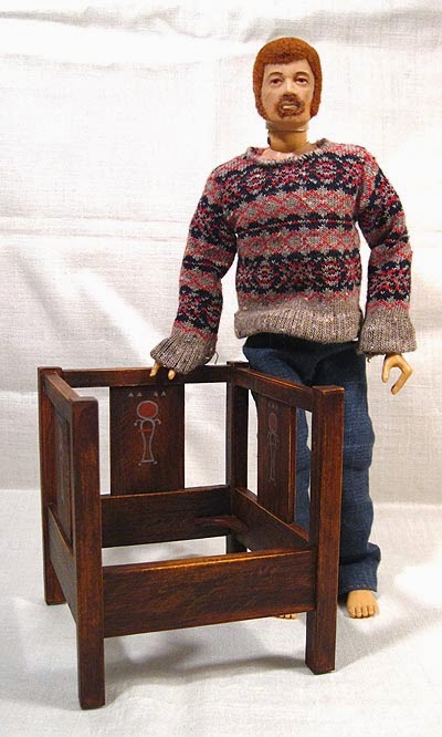
Joe's New Chair

So Joe went antiquing last weekend and look what he found. Score!

(He still doesn't have any shoes. Poor Joe.)

That's right, it's a Gustav Stickley cube chair, in pretty good condition. Well, actually it was designed by a guy named Harvey Ellis for Stickley's company, but close enough.


It's in quartersawn oak, and looks like it was darkened with ammonia fumes, a treatment that was all the rage at the time. It's a little worn here and there, true, but that's what they call 'patina' in the trade.


You can see that it's still got the little brackets that support the seat, although it didn't come with a cushion. Which is fine anyway as one may wish to custom make that to individually match one's décor. It also has little felt pads the last owner glued on the bottom of the legs so as to not scratch the floor.  Very considerate!


Here are some closeups of the back and side splats, featuring the Art Deco-ish designs that do look rather Egyptian influenced:


Alas, it didn't come with whatever was originally used to support the cushion proper.  But that's okay; Joe's already scared up an old hunk of plywood and cut it to fit:


He's a handy guy, Our Joe.

Without the cushion it's not very comfy, true, and it will certainly need a pillow in the back as well, as completely straight-backed chairs are never good on your lumbar region, but that's the problem with some Craftsman furniture.  If I may quote Frank Lloyd Wright on the hazards of allowing form to override considerations of function:

"I have been black and blue in some spot, somewhere, almost all my life from too intimate contacts with my own furniture."

Oh well.  We'll get Joe a pillow.  Maybe one of those embroidered ones with the Glasgow roses; that would be nice.


***

So. I used pictures from the internet for reference, one set of which had measurements, which was very nice. Also there are quite a few sites that have free plans for mission/craftsman furniture out there, including this place whose plans include a good deal of explanation, which is helpful. Unfortunately those pages seem to have been taken down when the site was recently I think redesigned (link via the Wayback Machine).

Since I don't have a whole lot of experience working in wood, and since though I do have the tools I don't have anywhere to set things up right now, I made this chair out of layered mat board, which idea I totally cribbed from Kris at One Inch Minis. 'Cause if there's one thing I've got, it's a freakin' ton of mat board scraps. Years ago I worked part time at a frame shop for this guy, who, in the interests of both anonymity and accuracy of character we'll call 'Dick'; he really was overall a piece of work but he did let me have the bits cut out of the inside of the mats. Mostly I figured I'd be doing some art on them, even if some of them were small, as many of them were this nice off-white acid-free rag stuff. They sure are coming in handy now, so I guess Dick was of some use to this planet after all. I would never have guessed.

It was pretty clear to me that if this little chair was going to hang together and be relatively sturdy it was going to have to have proper joints and not just be glued with the butt-ends together, and using mat board made that relatively easy, because I could just cut the separate layers differently. Also I'm nowhere near good enough right now to cut real mortise and tenons in itty-bitty oak, and besides where am I going to find one eighth inch thick oak? Luckily most mat board is about a sixteenth of an inch thick; in the more usual world of one-twelfth scale miniatures that works out to a neat three-quarters of an inch, which is the usual standard thickness for commercial lumber (in the US, anyway). At one-sixth scale that means it gets doubled, but that's easy enough with a bit of glue.

It's painted with acrylics and I kind of surprised myself with how much it looks like oak. I may do a tutorial later on how to get that finish as it was surprisingly easy and looks freakin' fantastic, if anyone's interested.

So there's Joe's chair. He doesn't have a house yet, but it's a start!

Labels: , , , ,

Sunday, July 6, 2014

Joe's Scarf

I've been researching Craftsman bungalows, to the point where I went to this place called a library and (legally) borrowed these things called books, in the hopes of figuring out how to configure the house that Joe wants. Because he wants a Craftsman bungalow, with the built-ins, and the lovely woodwork, and the earthy color palette. There are some pros and some cons to the things, though. One pro is that they tend to be small, and efficient, space-wise, which is good in a dollhouse, especially a one-sixth thing, which is going to be huge anyway. But on the con side, they are almost always built for narrow but fairly deep city lots, meaning, the short part of the house is the front, which is not helpful for a dollhouse, unless I figure out how to make it two rooms deep, which will entail hinged outer walls, which I kind of don't want to get into. They are also generally one storey, though there are sometimes a couple bedrooms upstairs. I think I would like Joe to have a living room, kitchen, dining room, two bedrooms and a bath.
I've done some sketches but it is tricky figuring out how to lay out something that by design has to be so one-sided. I especially want to have a lovely staircase in there somewhere.

So as I am pondering that, I have been making (or starting) a few random things, one of which is this little scarf for Joe.

I have a whole bunch of 20/2 wool (that's very tiny, like crewel-embroidery size) from the time a few years back when I was on this serious natural dyeing kick. Since I was looking to experiment with as many different colors as possible, I kept the skeins small. I had no idea at the time what I was ever going to actually use them for but I am finding they come in quite handy now. And because they are naturally dyed, all the colors have a lovely complexity and earthiness to them, which suits Joe and his Craftsman tastes just fine. Here's the scarf:


It's in seed stitch and I knit it with two bamboo skewers, the kind you'd use for shish-kebob. I sanded them a bit because they tended to be a little splintery, but they worked just fine. Here it is on Joe:


Poor Joe could use some shoes. He used to have a pair of combat boots, but they're lost now and anyway I think had a hole in them, not from wear and tear but because my little sister chewed a hole in them when she was a kid.

Anyway I picked a whole bunch of skeins in colors that harmonized, then picked two at a time to knit; I knit both together for a while, then switched one out for another color while still keeping the first, then after a while switched the first out for another while keeping the third (I hope you can follow that). It gave it a nice subtle color variation and I really like how it came out, such that I might try the same thing with a 1:1 scarf one of these days.

It looks good on Joe, don't you think?

Labels: , ,